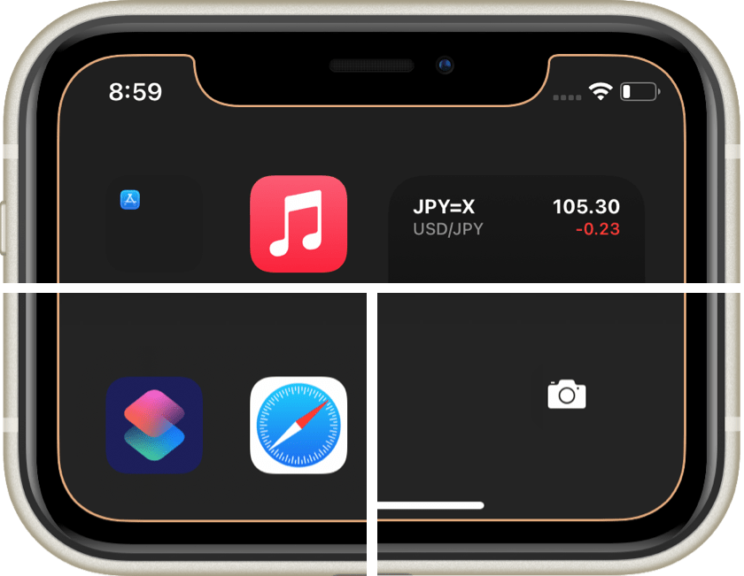
少し目に優しいプロテクター
The Protector Little Easier on the Eyes
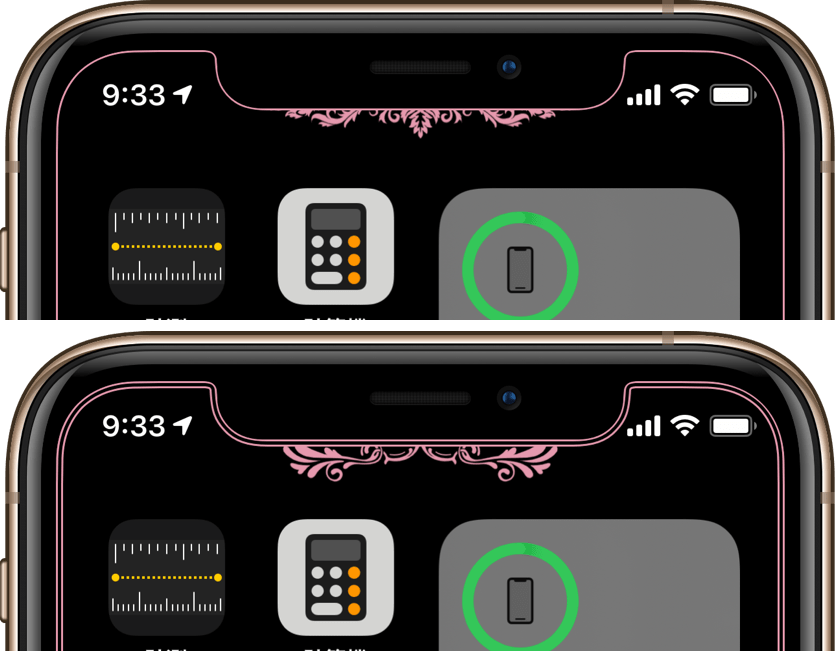
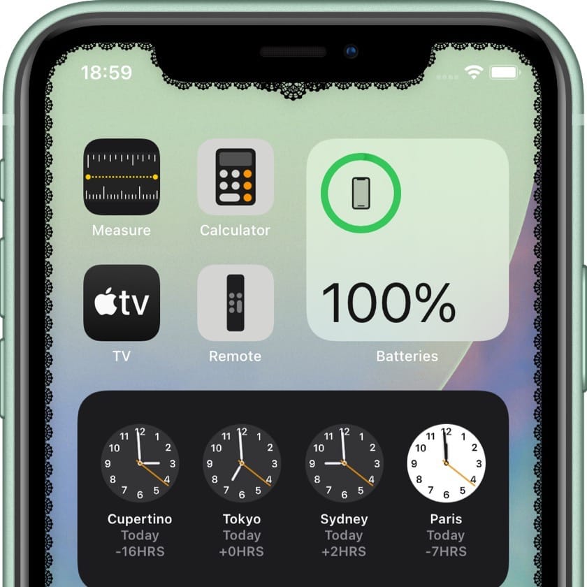
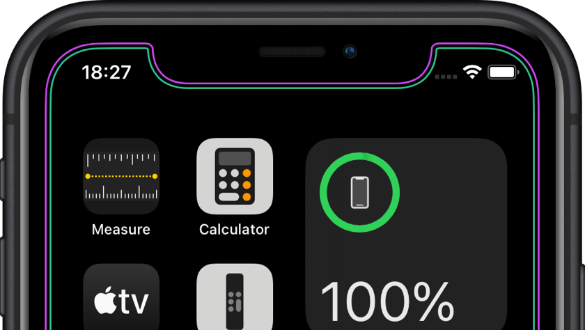
The wallpaper that makes the iPhone bezel a protector design is now compatible with iOS 14.
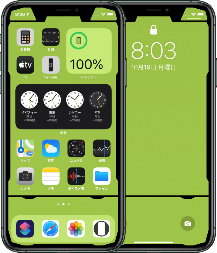
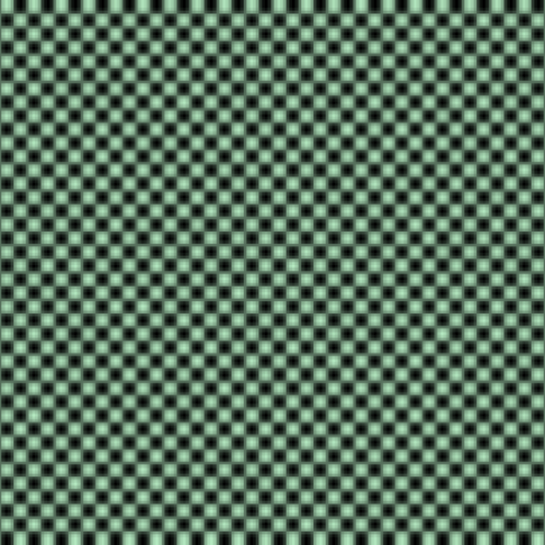
また今回は背景にかすかにノイズを敷き詰めました。全面一色に比べて目への刺激を減らします(個人の感想です)。
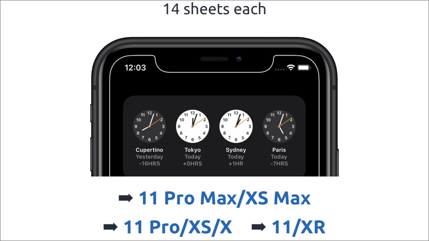
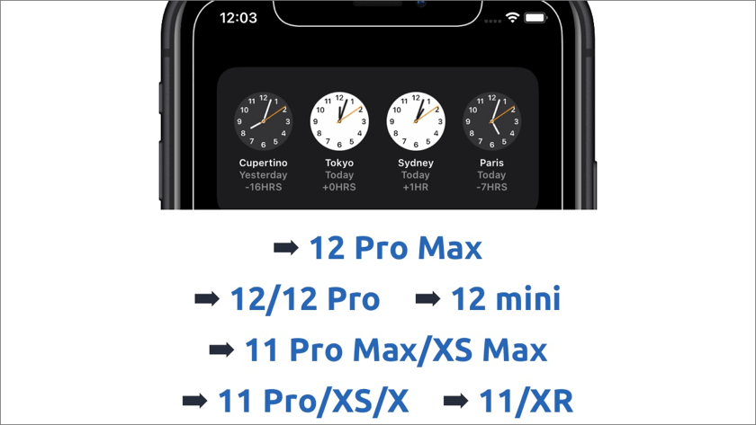
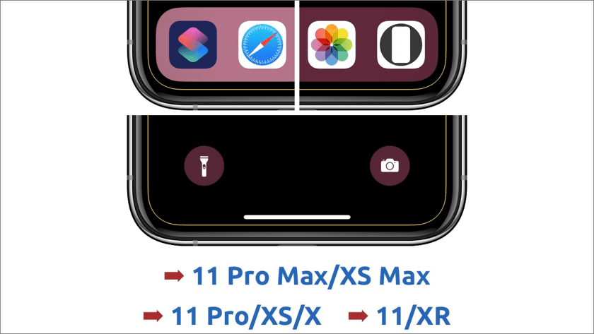
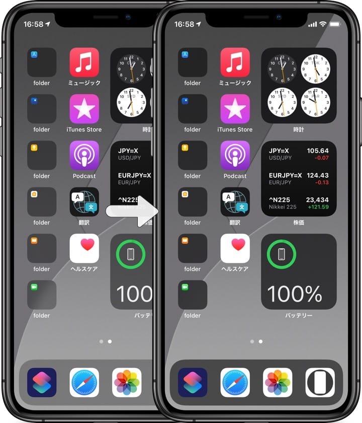
The bar has been repositioned to fit the height of the Dock, page controls and icons for the full screen iPhones. Optimized for a slightly modified status bar width for the Home button iPhones.
Also, this time I've laid down a faint noise in the backgrounds. It reduces the irritation to the eyes compared to the whole surface being one color (It's my personal impression.).
iOS 14– 20 sheets each
➡︎ iPhone 11 Pro Max/XS Max
➡︎ iPhone 11 Pro/XS/X
➡︎ iPhone 11/XR
iOS 11– 20 sheets each
➡︎ iPhone SE/8/7/6s
➡︎ iPhone 8 Plus/7 Plus/6s Plus
➡︎ iPhone SE1/iPod touch 7 (SE/8/7/6s-ᴀA)
For the Home button iPhones, it's not optimal, but it's just about usable on iOS 11 or later, even under iOS 14.This means that you can use earlier versions of wallpapers on iOS 14, but I decided to improve the background and made some minor adjustments.
