マイクロライトの壁紙
Micro Light
iOS 17–
iPhone 15 Pro Max/15 Pro/15 Plus/15/
14 Pro Max/14 Pro/14 Plus/14/
13 Pro Max/13 Pro/13/13 mini/
12 Pro Max/12 Pro/12/12 mini/
11 Pro Max/11 Pro/11/XS Max/XS/XR
iPhone 15 Pro Max/15 Pro/15 Plus/15/
14 Pro Max/14 Pro/14 Plus/14/
13 Pro Max/13 Pro/13/13 mini/
12 Pro Max/12 Pro/12/12 mini/
11 Pro Max/11 Pro/11/XS Max/XS/XR
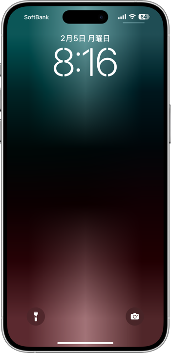
スリープ解除で点灯します。
マイクロ画像が作る超柔らかグラデ。
Lights up when waked.
Super soft gradient made of micro images.
マイクロ画像が作る超柔らかグラデ。
Lights up when waked.
Super soft gradient made of micro images.
3×7
Universal Wallpaper
Universal Wallpaper
How to Set
設定時に動かさない・「自然光」限定
Don't move it on setup and NATURAL limited.
Help
常時点灯モデルでは「常に画面オン」を無効に。
(設定 > 画面表示と明るさ > 常に画面オン)
On models with Always On Display, Disable it.
(Settings > Display & Brightness > Always On Display)
Don't move it on setup and NATURAL limited.
Help
常時点灯モデルでは「常に画面オン」を無効に。
(設定 > 画面表示と明るさ > 常に画面オン)
On models with Always On Display, Disable it.
(Settings > Display & Brightness > Always On Display)
画像を長押し保存してください。
Tap and hold to save the image.
▼
Tap and hold to save the image.
▼


❗️❗️注意点とチェック項目
❗️❗️Notes and Checklists
- 壁紙を設定した後で再び設定画面に入ると(ウィジェットの変更など)、光が脱色されてしまいます。元に戻すには一度他の壁紙を設定した後で再度設定し直してください。同じ壁紙のままではもう一度やっても変更なしの扱いになります。これを利用してわざと彩度を下げることもできます。
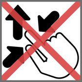
- ピンチ操作は利きません。設定中に壁紙を動かすと画面上部が若干暗くなります。
- 背景と要素の明暗差を保つ必要があるため、カラー調整で背景色を変えると効果が失われます。明るい屋外でも動きは悪くなります。
- このページでは3×7ピクセルの壁紙を、保存しやすいように120×280ピクセル相当に引き伸ばして表示しています。
- 常時点灯モデルで「壁紙を表示」をオフにしても「常に画面オン」が有効だと動いては見えません。無効にしてお使いください。もちろん点灯するギミックを使わずにグラデーションを楽しむだけなら「常に画面オン」をオンにしていただいてかまいません。
❗️❗️Notes and Checklists
- If you enter the settings screen again after setting a wallpaper (e.g., changing widgets), the light will be decolorized. To restore the original color, set another wallpaper and then set it again. If you keep the same wallpaper, it will be treated as unchanged even if you try again. This can be used to intentionally reduce saturation.
- Pinch does not work. If the wallpaper is moved during setting, the upper part of the screen will be slightly darkened.
- Since the difference between light and dark must be maintained, changing the background color in the color adjustment will lose the effect. Movement will also be poor in bright outdoors.
- The 3 x 7 pixel wallpapers on this page are stretched to the equivalent of 120 x 280 pixels to make them easier to save.
- Models with Always On Display, even if Show Wallpaper is turned off, it will not appear to be moving if Always On Display is enabled. Please disable it. Of course, if you just want to enjoy the gradation without using the lighting gimmick, you can turn on Always On Display.
iPhoneはスリープ解除の瞬間に、ほんの一瞬ですが画面をゆっくり明るくします。すると壁紙は明るい部分から見え始め、暗い部分が遅れて表示されます。この壁紙ではグラデーションで点灯する光を表現しました。なおTouch IDモデルでは一気にホーム画面まで行ってしまうのであまり見る時間がありません。
通常黒い背景でのグラデーションはなめらかにならずどうしても縞模様が現れるのですが、今回は幅3ピクセル高さ7ピクセルという極小サイズでそれを回避しています。あまりに画像が小さいと、iOSがグラデーションを通常の画像では不可能なレベルで綺麗にぼかしてくれるのです。縞模様を目立たなくするためにノイズを重ねるなどの対策も要りません。
写真アプリでこの壁紙を表示すると綺麗なグラデーションになります(サムネイルではドット絵のように見えます)。それをスクショした画像も綺麗です。しかしスクショを壁紙にすると縞模様が出てしまいます。通常サイズでは無理なのです。
iOS 11以来その機能が変更されて小さな壁紙は綺麗に表示されなくなっていたのですが、iOS 17で復活しました。また通常のサイズでは壁紙の表示位置はまちまちですが、極小画像だと拡大縮小はできない代わりにアスペクトさえ合っていれば常に全画面表示になるようです。
制作上の難点は色を安定させるのが難しいことでした。iOS 17は壁紙の彩度を下げる仕様になっているのも関係あるかもしれません。元画像 > ロック画面 > ホーム画面の順に彩度は低くなります(淡い色の場合は彩度は維持されます)。そしてこのサイズでは黒と上下の色同士が干渉します。機種と色によっては上下の色が明らかに違ってしまったりするのです。かと言って光源を片方だけにすると今度は残った一つが変色してしまいます。
画像をほんの少し大きくすれば防げるのですが、このシンプルなグラデーションはこのサイズでしか作れません。そこで色々と調整しました。どうしてもうまくいかず、またそれほどいい感じにもならなかったので作らなかったのが上下とも白、オレンジ、黄色なのです。それでも上下を別の色にするなどして可能な限りのバリエーションを用意しました。
When the iPhone wakes up from sleep mode, the screen slowly brightens, but only momentarily. The wallpaper then begins to be seen from the light areas, with the dark areas appearing later. In this wallpaper I used a gradient to represent the light that lights up. Note that the Touch ID model goes all the way to the home screen at once, so there is not much time to look at it.
Usually gradients on black backgrounds are not smooth and inevitably show stripes, but I have avoided this by using a very small size (3 pixels wide by 7 pixels high). If the image is too small, iOS will blur the gradient nicely at a level not possible with normal images. No measures such as layering noise to make the stripes less noticeable are also unnecessary.
If you view this wallpaper in Photos, you will see a beautiful gradation (In the thumbnail it looks like dot art.). The screenshot image is also beautiful. But if you make it your wallpaper, you will see stripes. It is not possible in normal size.
Since iOS 11, that function has been changed and small wallpapers are no longer displayed nicely, but it has been restored in iOS 17. Also, in normal size, the wallpaper is displayed in different positions, but with a very small image, it appears to always be displayed in full screen as long as the aspect is correct, instead of being able to zoom in and out.
The difficulty in creating this image was that it was difficult to stabilize the colors. iOS 17 is designed to reduce the saturation of wallpaper, which may have something to do with this. The saturation is reduced in the order of source image > Lock Screen > Home Screen (the saturation is maintained for light colors). And at this size, the black and top and bottom colors interfere with each other. Depending on the model and color, the top and bottom colors may be clearly different. However, if only one of the light sources is used, the remaining one will be discolored.
These can be prevented by making the image just a little bit larger, but this simple gradation can only be created at this size. So I made various adjustments. But it still didn't work, and it didn't look that good, so I didn't make the white, orange and yellow on the top and bottom. Nevertheless, I have provided every possible variation by making the top and bottom different colors, etc.