イレイザー壁紙 タイプX
Eraser Type X
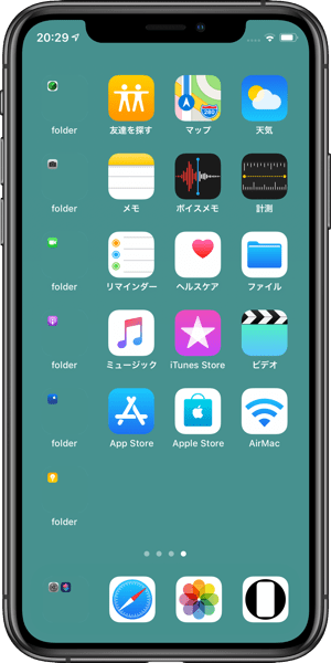
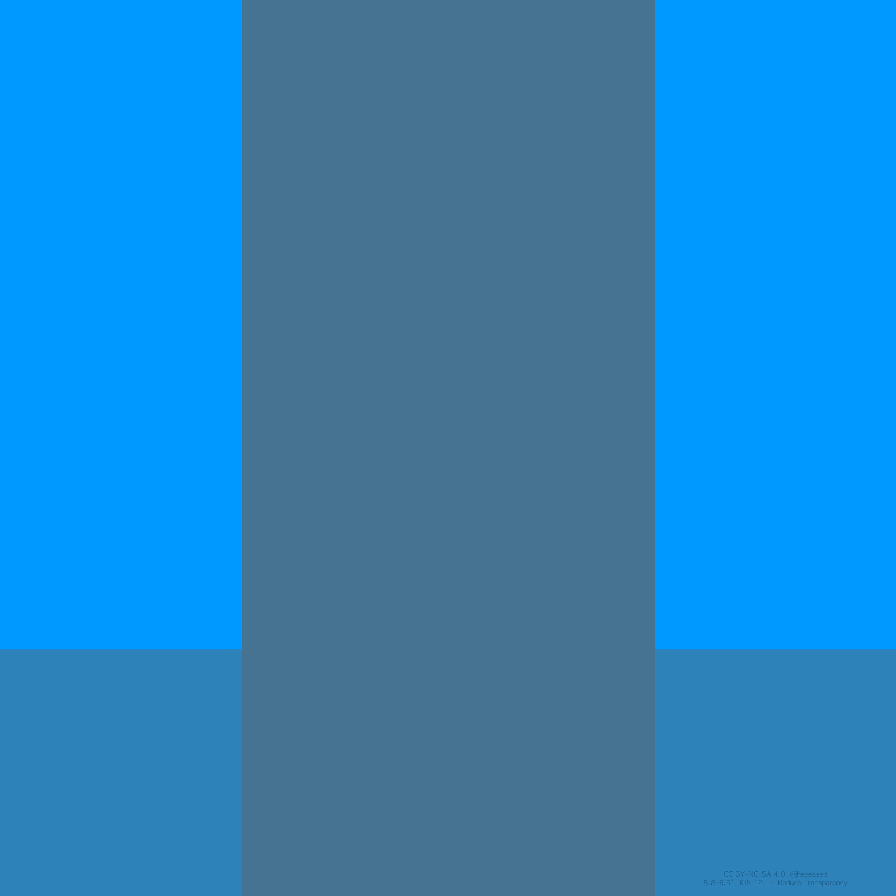
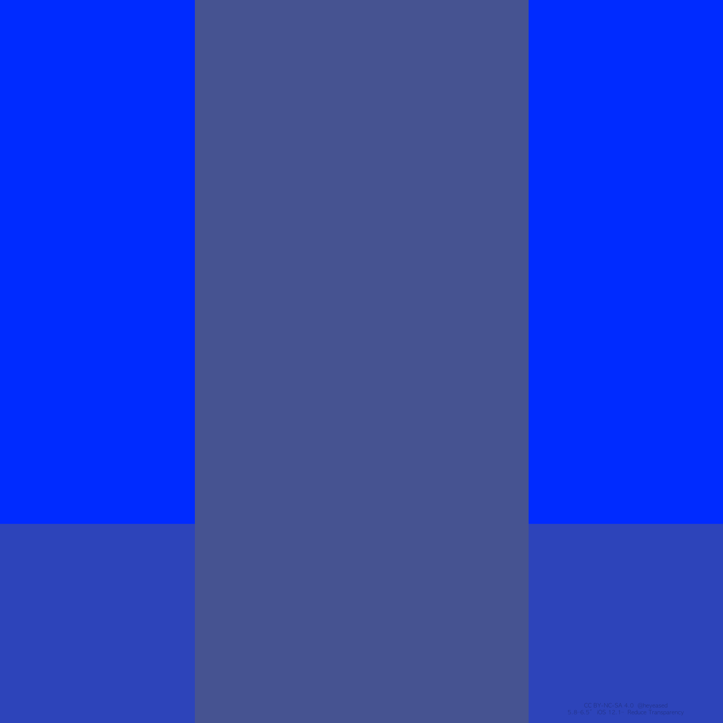
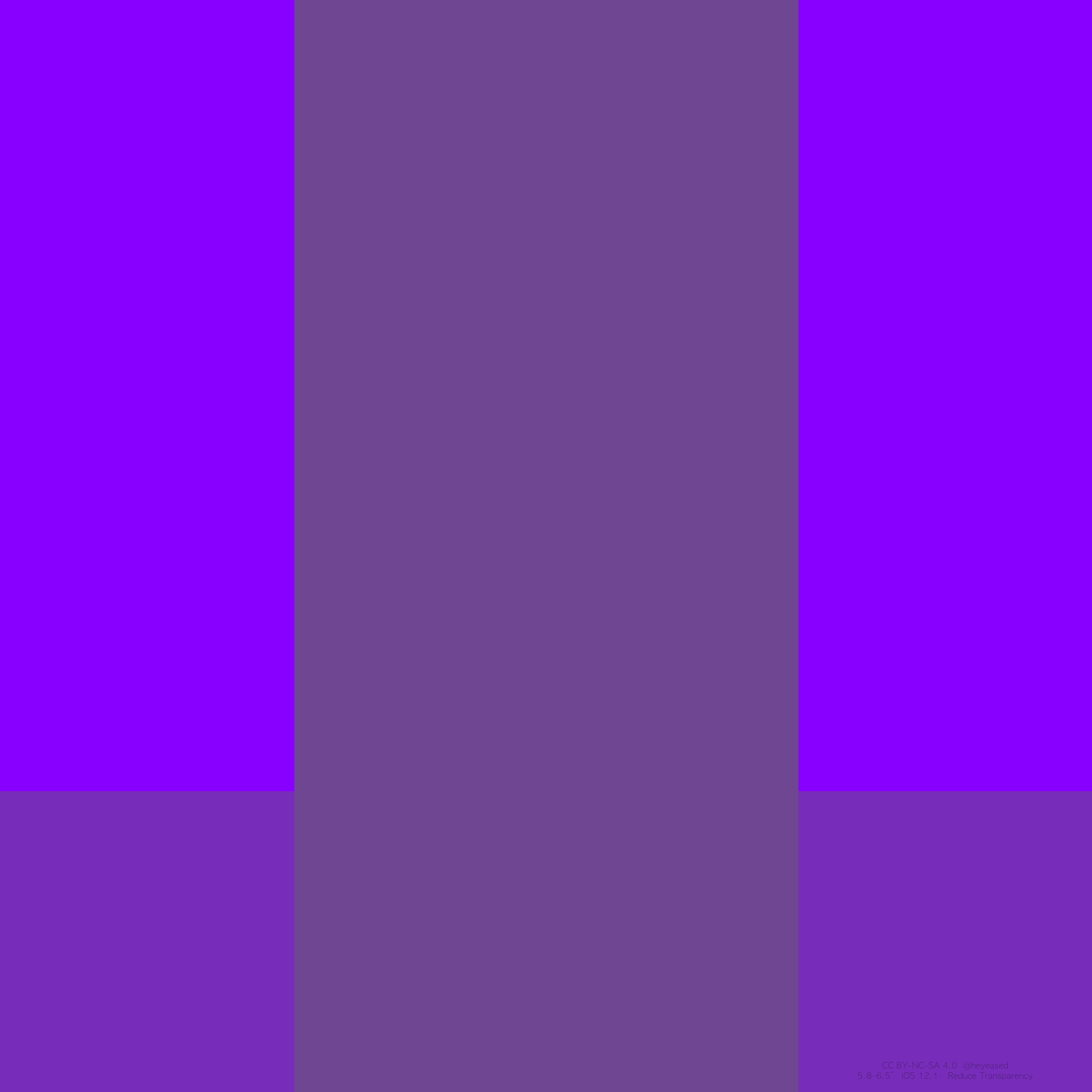
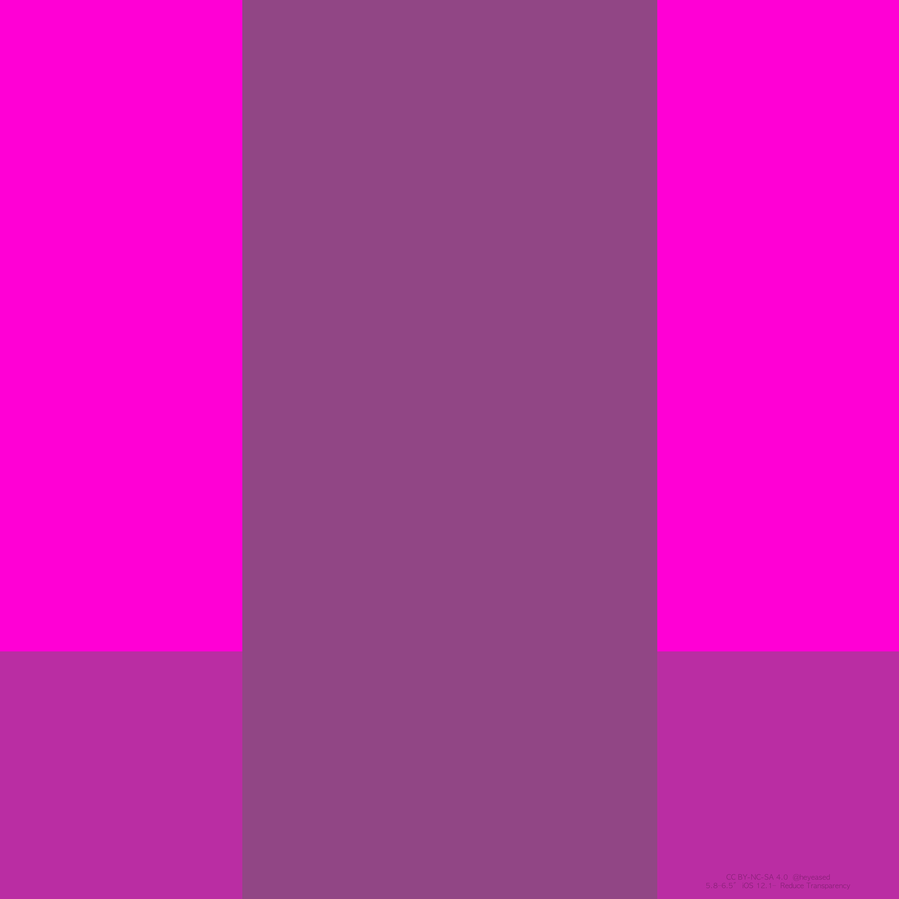
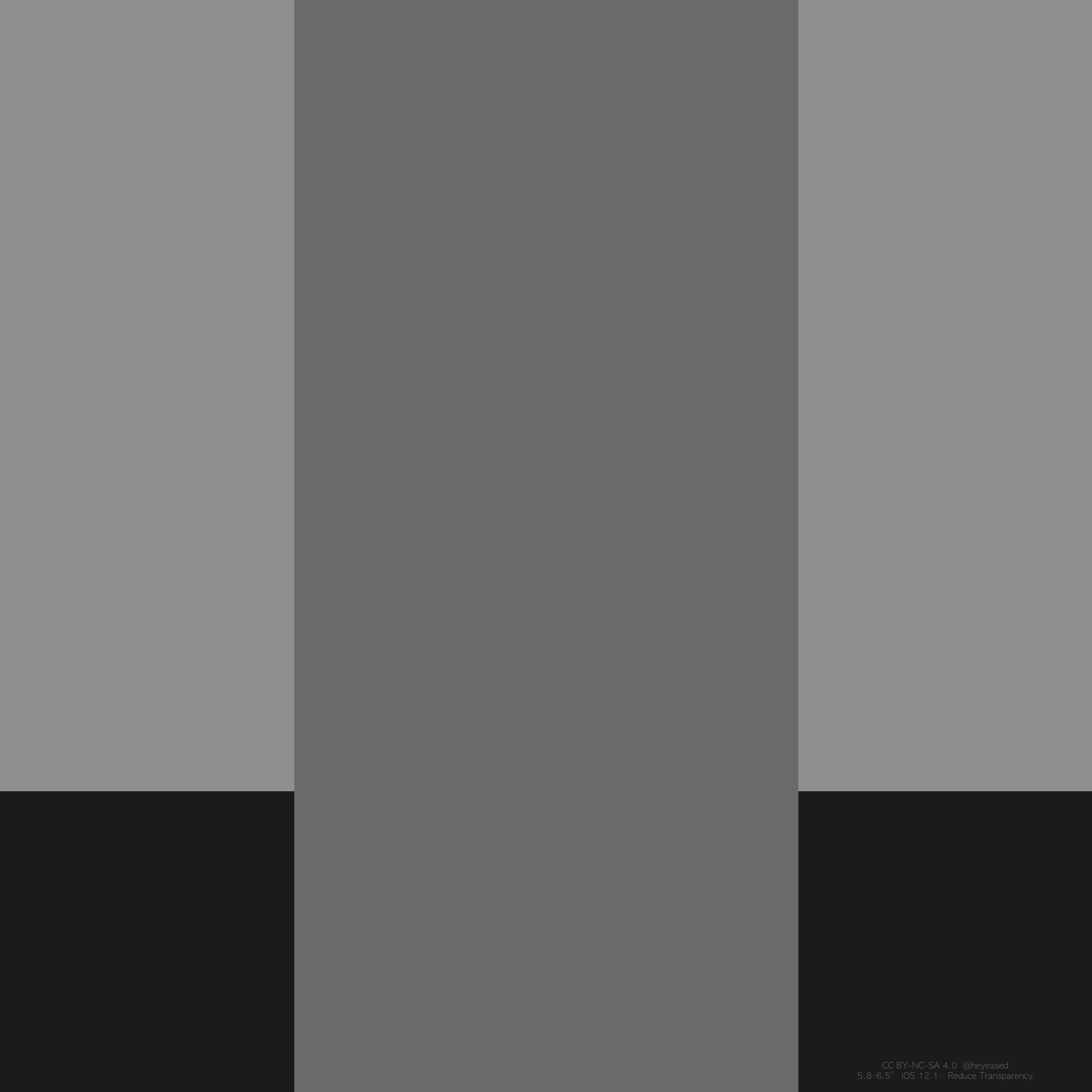
ドックとフォルダを隠す壁紙。
落ち着いた色のフルスクリーン用。
Wallpapers to hide Dock and folders.
Calm colors for full screen.
落ち着いた色のフルスクリーン用。
Wallpapers to hide Dock and folders.
Calm colors for full screen.
iOS 12.1–13.1
iPhone 11 Pro Max/XS Max/
11 Pro/XS/X/11/XR
iPhone 11 Pro Max/XS Max/
11 Pro/XS/X/11/XR
3072×3072
Universal Wallpaper
Universal Wallpaper
必ず壁紙を設定する前に
設定 > アクセシビリティ >
画面表示とテキストサイズ >
透明度を下げるをオンに。
(iOS 12 → 一般 > アクセシビリティ)
設定 > アクセシビリティ >
画面表示とテキストサイズ >
透明度を下げるをオンに。
(iOS 12 → 一般 > アクセシビリティ)
ご注意
視差効果: オフ
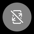
視差効果: オフ
設定中は「視差効果を減らす」をオフ。
「ダークモードで壁紙を暗くする」はオフ。
「ダークモードで壁紙を暗くする」はオフ。
サムネイルをタップしてダウンロード
iOS 13.0では正しく表示されないかもしれません
しかし壁紙は正常に保存できます
iOS 13.0では正しく表示されないかもしれません
しかし壁紙は正常に保存できます
Be sure to before set wallpaper
Settings > Accessibility >
Display & Text Size >
Turn on Reduce Transparency.
(iOS 12 → General > Accebility)
Settings > Accessibility >
Display & Text Size >
Turn on Reduce Transparency.
(iOS 12 → General > Accebility)
Notes
Perspective Zoom: Off
Perspective Zoom: Off
Reduce Motion: Off during setting.
Dark Appearance Dims Wallpaper: Off
Dark Appearance Dims Wallpaper: Off
Tap the thumbnail to download.
In iOS 13.0, the displayed image may be broken.
But the wallpaper can be saved normally.
In iOS 13.0, the displayed image may be broken.
But the wallpaper can be saved normally.

フォルダ名用 空白文字
下の[ ]内をコピーしてお使いください。
[⠀]
↑
For folder name, copy the empty letter.
下の[ ]内をコピーしてお使いください。
[⠀]
↑
For folder name, copy the empty letter.
下記の場合は一度他の壁紙を設定した後で再設定してください(同じ壁紙では条件を変えても最初の状態がキープされます)
- 壁紙を設定後に「透明度を下げる」をオンにしても色は合いません。設定後にオンオフを切り替えた場合も同様です。
- 写真アプリから設定すると稀に落ちます。その場合は色が合わない可能性があります。
- 長時間使わなかったり、再起動など何かの拍子にドックの色が変わる可能性があります。
In the following cases, set it again after setting other wallpaper (In the same wallpaper, the first state is kept even if changing conditions)
- Even if Reduce Transparency is turned on after setting the wallpaper, the colors do not match. The same is true when switching on/off after setting.
- If set in Photos it will rarely crush. In that case the color may not match.
- There is a possibility that the color of the Dock will change due to some reasons, such as not using for a long time or restarting.
注意事項補足
- フォルダのコーナーにはかすかに線が出ます。
- 設定中に壁紙をスワイプすると、視差効果をオフにする時にポジションが戻ったように見えても実際はずれています。動かしてしまった場合は一度キャンセルして最初からやり直してください。
- 普段「視差効果を減らす」をオンでお使いの方は設定時だけオフにしてください。(設定 > アクセシビリティ > 動作 > 視差効果を減らす)
- ダウンロードに時間がかかった場合、読み込み終了前に画像を保存すると絵の一部が壊れた状態で保存されます。全体が表示されるまで待ってください。
- iOS 13以降でダークモードにしている場合に「ダークモードで壁紙を暗くする」がオンになっていると背景だけが暗くなります。デフォルトではオフですがオンになっている場合は 設定 > 壁紙 >「ダークモードで壁紙を暗くする」をオフにしてください。
Notes Supplement
- Lines appear slightly in the corners of folders.
- If you swipe the wallpaper in the setting, even if it looks like the position back when turning off Perspective Zoom, it is actually dislocated. If it has moved, cancel it once and start over.
- If you normally use Reduce Motion on, turn it off only during setup. (Settings > Accessibility > Motion > Reduce Motion)
- f it takes time to download, if you save the image before loading finishes, the lower part breaks. Wait until the whole is displayed.
- If you are in Dark Mode on iOS 13 or later and Dark Appearance Dims Wallpaper is turned on, only the background will be dark. It is off by default, but if it is on, turn off Settings > Wallpaper > Dark Appearance Dims Wallpaper.
なぜ?
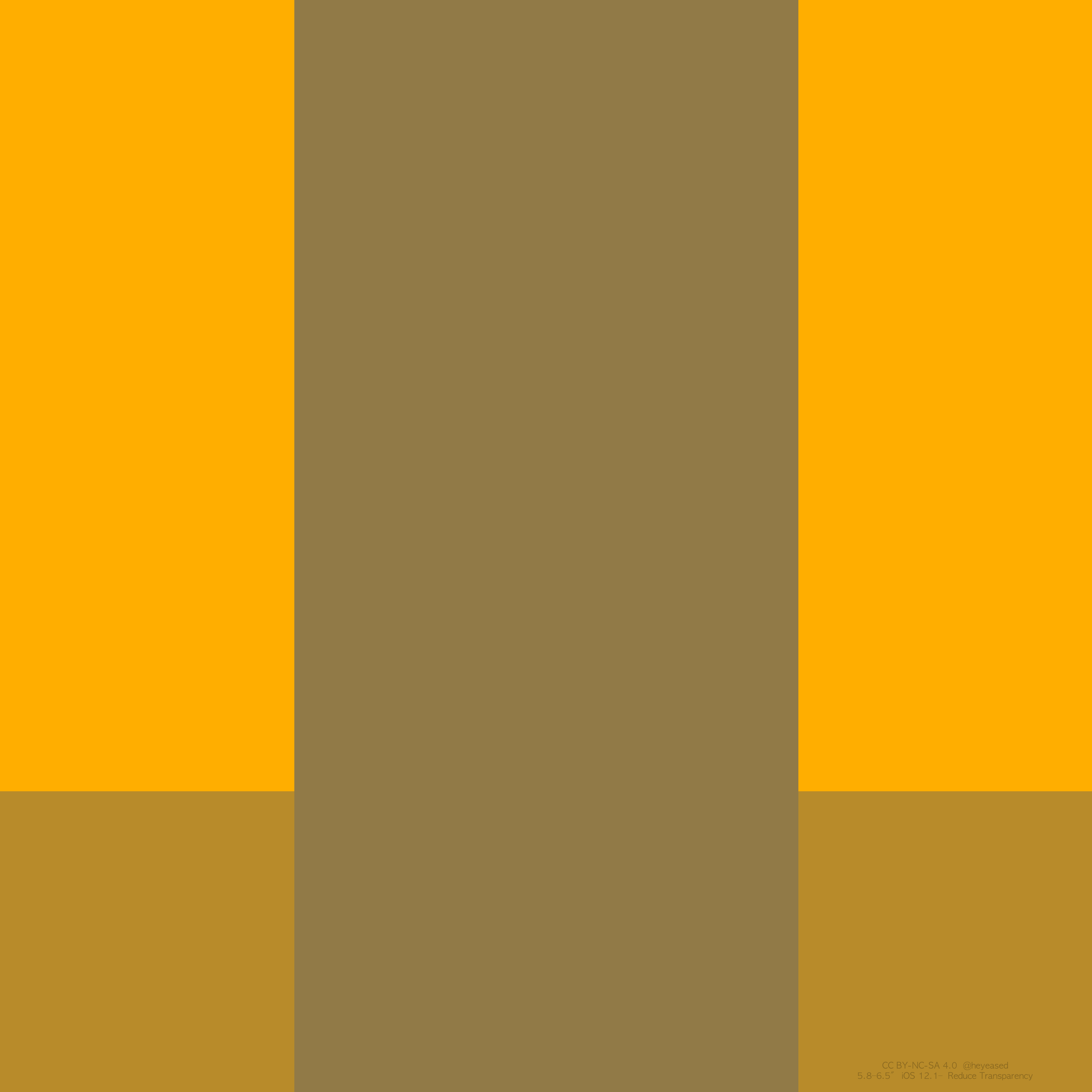
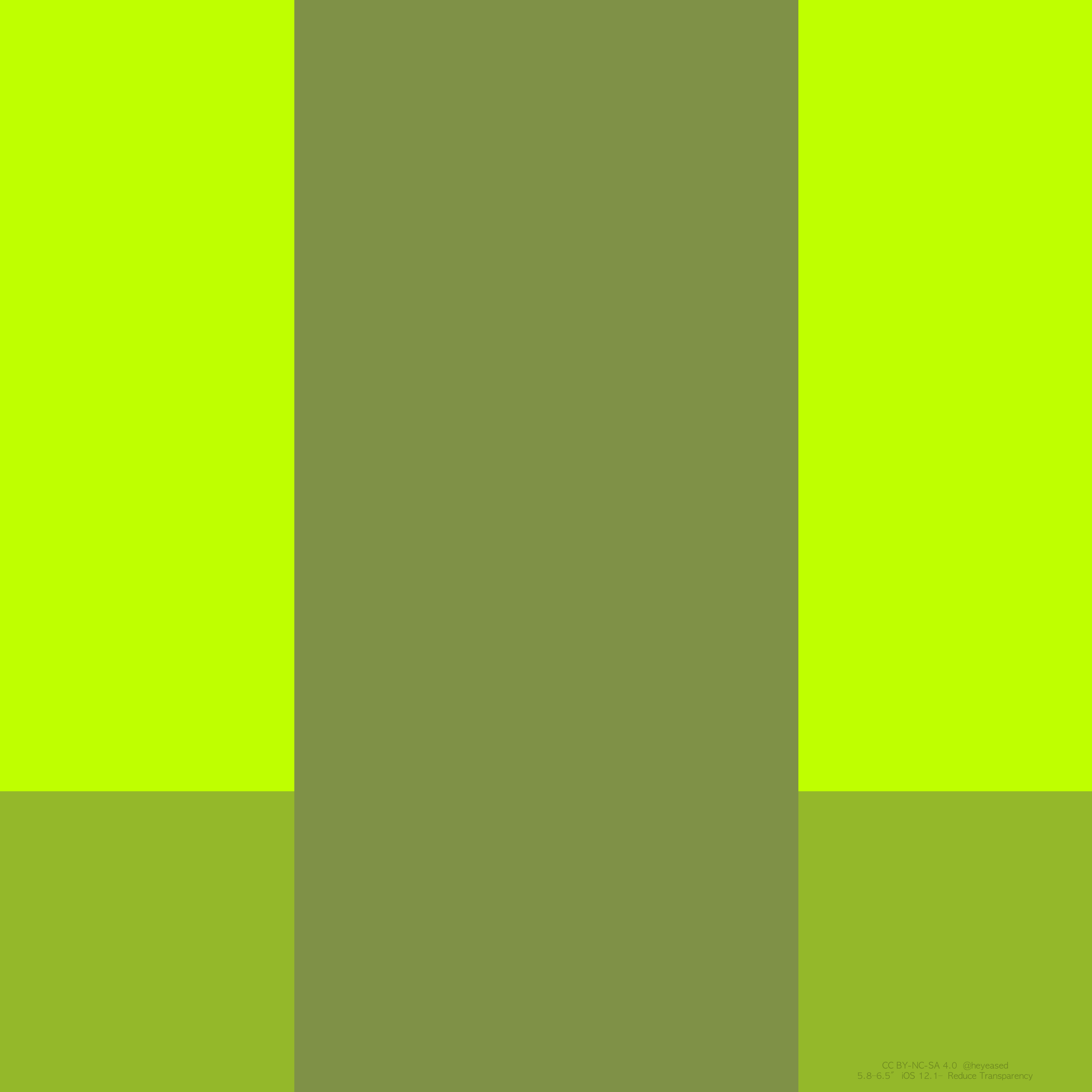
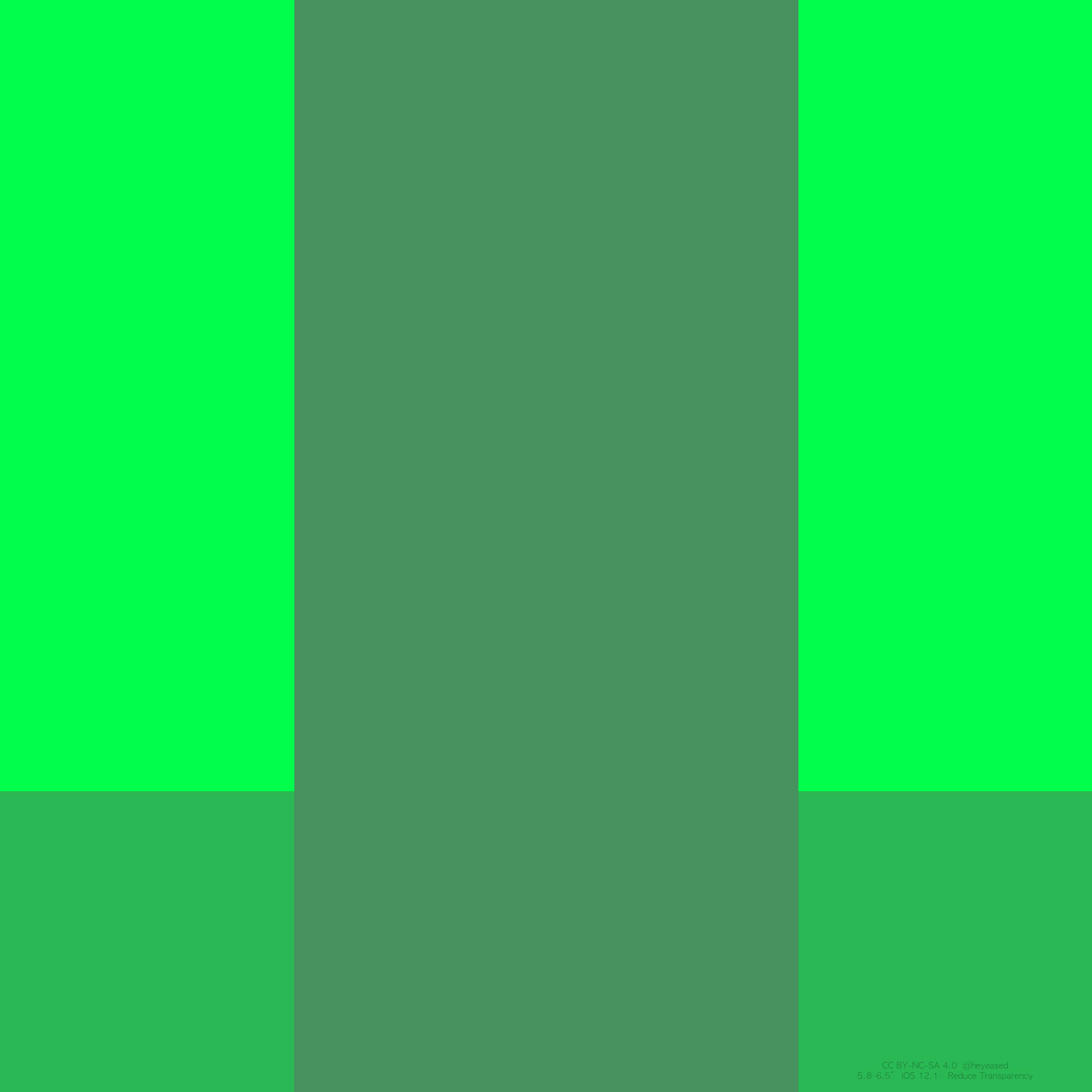
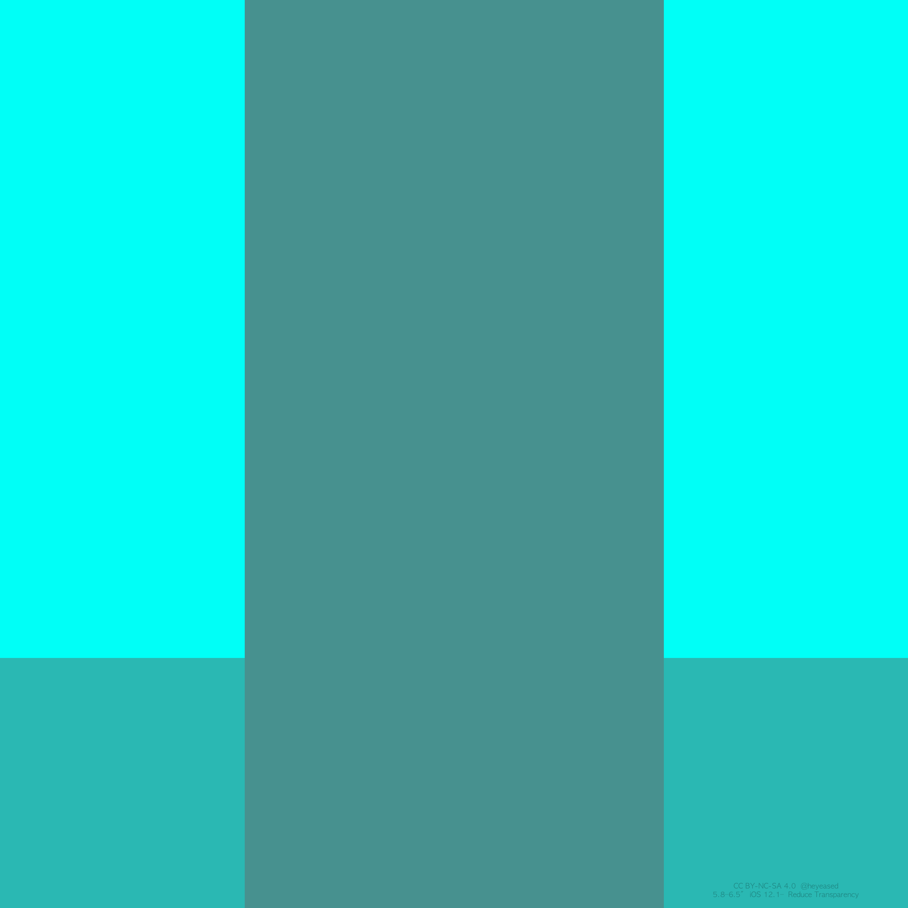
ドックの色は壁紙の下の方の、フォルダの色は全体で決まります。それぞれが背景と同じ色になるように調整しました。以下の2つのルールを利用したトリックです。
第一にiOS 12で変更された「透明度を下げる」のルール。以前はドックとフォルダは常に一定のグレーでした。新しい「透明度を下げる」機能では背景によってドックとフォルダの色が変わります。ただし通常モードのように背景が透ける演出はありません。全体の平均色がベースになります。
第二にiOS 11.3以降のランドスケープ対応・非対応デバイスの壁紙計測範囲の統一。それまではランドスケープ対応機種では正方形の壁紙全体を計測、それ以外の機種では正方形の壁紙でも長方形の範囲のみが計測されていました。11.3からはどのiOSデバイスもとりあえず正方形なら全体を計測するようになっています(横長や一定以上縦長の壁紙には適用されません)。
つまり正方形の壁紙で表示範囲外に強い色を置いて「透明度を下げる」をオンにしておけば、画面には見えない色をドックとフォルダに反映させることができます。
表示範囲のアスペクトによって配色バランスは異なります。この壁紙はX系のiPhone用です。
なお「静止画」設定だと正方形全体は計測されず、わずかに左右がカットされるようです。その分色が弱くなるはずですが左右をぎりぎりまで使うことで逆に強くできます。しかし上下には調整用の色は置いていません。そこまでしても色の変化は1%程度。それなのに機種による色の違いが現れます。3種類作るほどの差ではないためそこまでは追い込んでいません。
ライトグレーはXシリーズのみのカラーです。なぜか明るい方が黒が広くなければいけません。壁紙が暗くなりすぎるとフォルダが明るくなってしまいます。ナンバー付きiPhoneではちょうどいい色になる前にフォルダが明るくなり、それに合わせると今度はフォルダが暗くなってしまいます。
充分なカラバリを揃える前にiOS 12.1で色が変わってしまったため、iOS 12.0はスキップしています。
画像のサイズが大きかったり小さかったりすると、壁紙を設定する時に写真アプリは落ちやすくなります。Appleが推奨しているのは設定アプリを使った方法で、写真を使うのはショートカットだと思われます。この壁紙は正方形なので必然的に大きくなります。
Why?
The color of the Dock is made by the bottom of the wallpaper, the color of folders is made by entirely. I adjusted each to be the same color as the background. It is a trick using the following two rules.
First, the Reduce Transparency rule changed in iOS 12. Previously Dock and folders have been always a constant gray. In the new rule, the colors of the Dock and folders change depending on the background. However, as in normal mode there is no direct display through which the background is transparent. The average color of the whole is the base.
Next, unifying the wallpaper measurement range of landscape compatible/noncompliant devices after iOS 11.3. Until then, the whole wall of the square wallpaper was measured in the landscape-compatible model, and in the other models only the rectangular range was measured even in the square shape. After 11.3, any iOS device measures the whole if square wallpaper (it does not apply to horizontal or certain vertically wallpaper).
So, if strong colors are placed outside the display with a square wallpaper and Reduce Transparency is turned on, Dock and folders are controlled with hidden colors.
The color balance varies depending on the aspect of the display. These wallpapers are for the X series iPhones.
When Still, the entire square is not measured, it seems that the sides are cut slightly. Therefore, the color should weaken, but it becomes stronger by using the non-display range to the last minute. However, there are no adjustment colors on the top and bottom. Even with that, color change is about 1%. Even so, the color changes depending on the model. Because it is not enough to make three kinds, it is not pursuing so far.
Light gray is a color of X series only. For some reason the brighter one must have a wider black. If wallpaper gets too dark folders will make the color brighter. With the numbered iPhone, folders are brighter before it gets just right. When the background is set to it, the folder gets dark.
iOS 12.0 is skipped because the color changes in iOS 12.1 before making enough color variations.
If the size of the image is large or small, Photos will tend to crash when setting wallpaper. Apple recommends using Settings. It seems that using Photos is a shortcut. This wallpaper is necessarily large because it is square.