The web clip icon and icon name of this site has been changed.
This time I made a smooth rounded corner to match the Approach R of the iOS icon. Red in the center image is an ordinary rounded corner. It's very slight difference. However, if it is made with rounded corners (image below) it feels somewhat smooth.
For the icon of Static Dynamic Wallpapers, I got a trick to blink with page scrolling.
In principle, I left the old icon on the page that does not correspond to the new iOS.
ウェブクリップアイコンとアイコン名を変更しています。
今回はiOSアイコンのアプローチRに合わせた滑らかな角丸で作りました。中央の画像の赤が普通の角丸です。極めて小さな違いですが、角丸で作ると(下の画像)なんとなくスムーズじゃない気がします。
動く静止画のアイコンにはページスクロールで明滅するトリックを仕掛けました。
原則として、新iOSに対応しないページには古いアイコンを残しました。
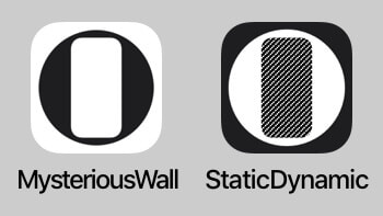
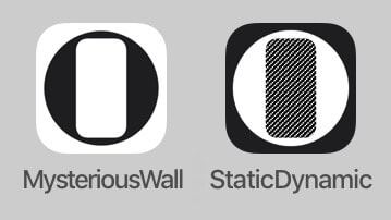
New Icons
新アイコン
Additional notes: I forgot to write. The width of the symbol conforms to the grid line, and the golden ratio is hidden by the roundabout way to the height.
追記:書き忘れていましたが、シンボルの幅はグリッドラインに合わせて高さには回りくどい黄金比を隠しています。
追記:書き忘れていましたが、シンボルの幅はグリッドラインに合わせて高さには回りくどい黄金比を隠しています。
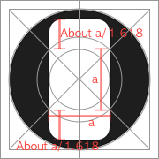
September 2 Additional notes 2: On the curve of the corner, I traced the approach R more accurately according to the scale.
9月1日追記2:コーナーのカーブで、スケールに合わせてより正確にアプローチRをトレースしました。
9月1日追記2:コーナーのカーブで、スケールに合わせてより正確にアプローチRをトレースしました。
Comparison
比較
比較
White is approach R,
red is rounded corner.
白がアプローチR、赤が角丸

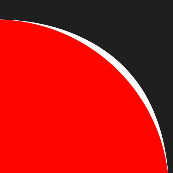
If it is made with round corners.
角丸で作った 場合