マークグレーの壁紙
Marked Gray
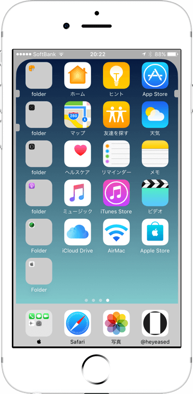
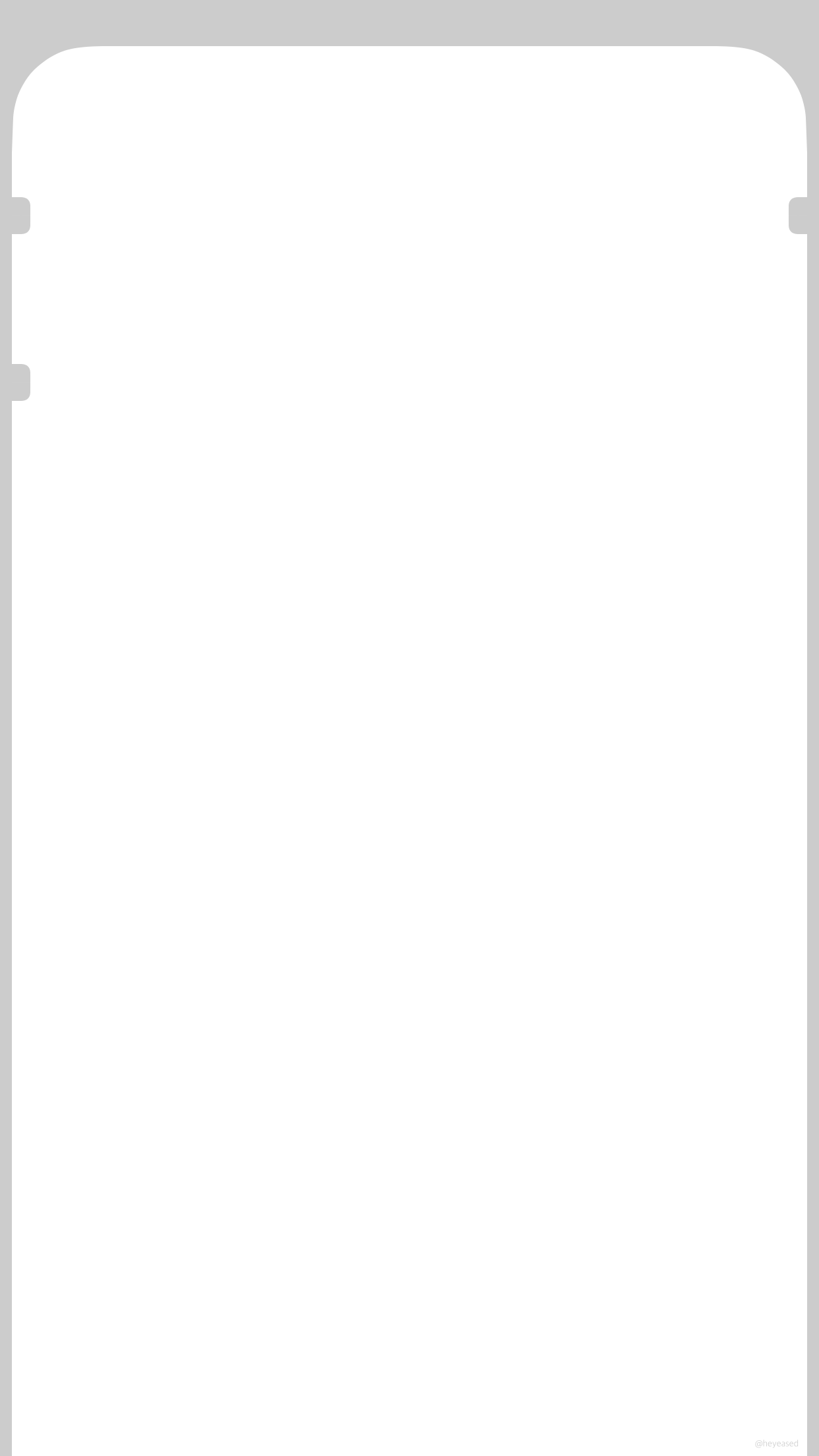
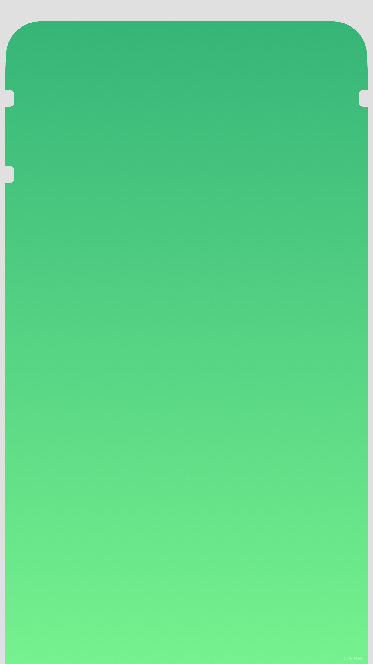
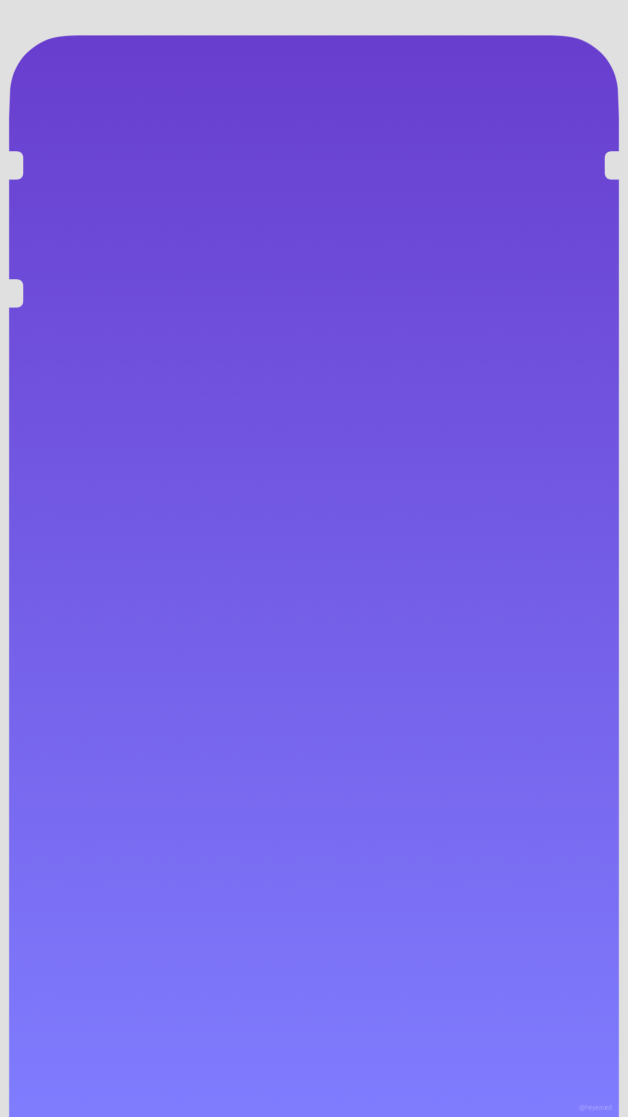
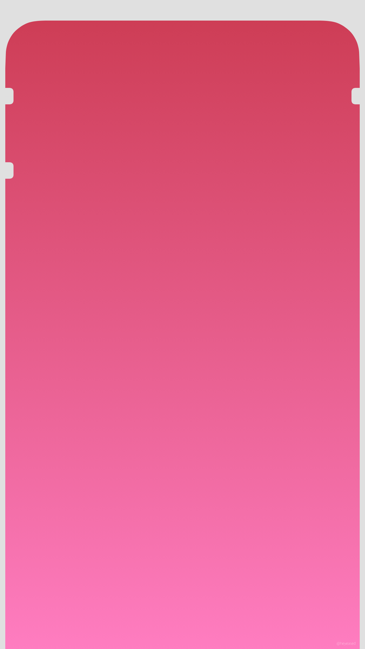
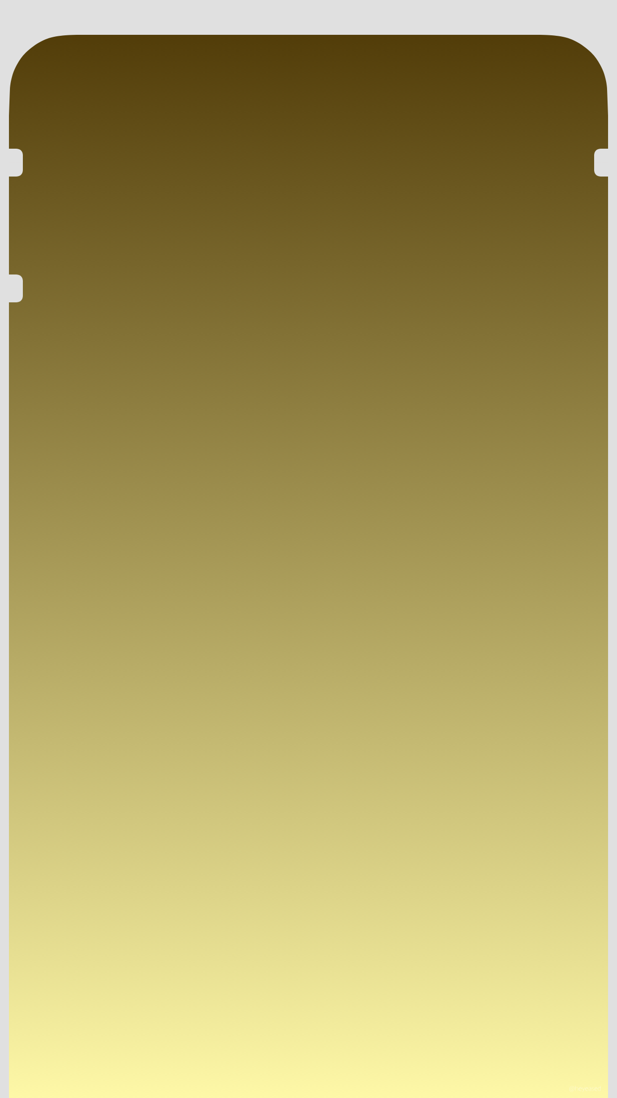
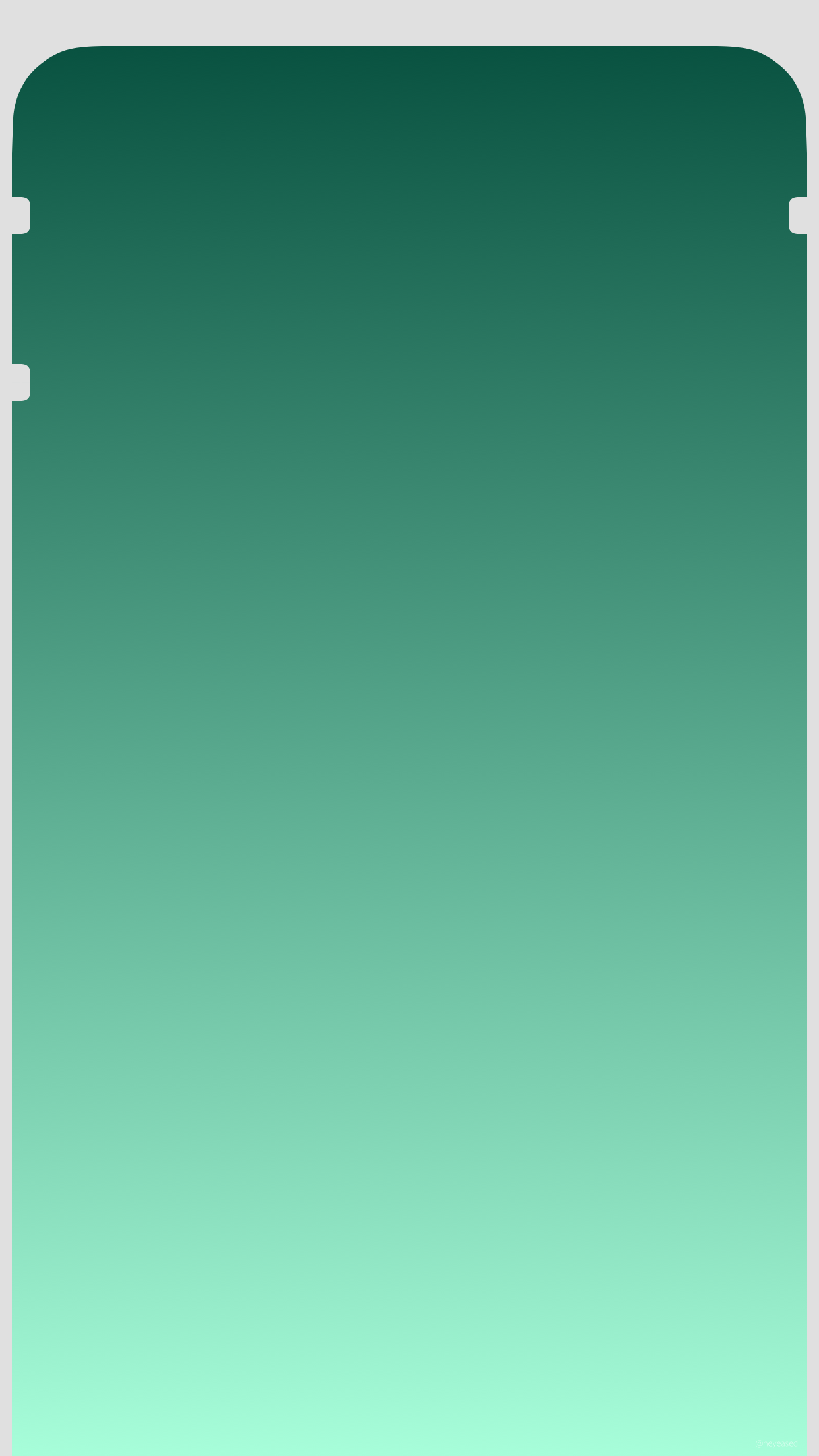
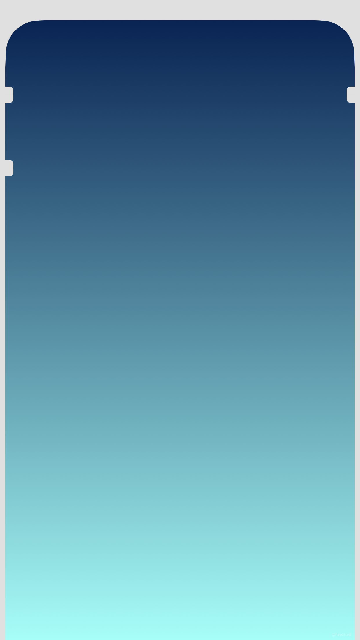
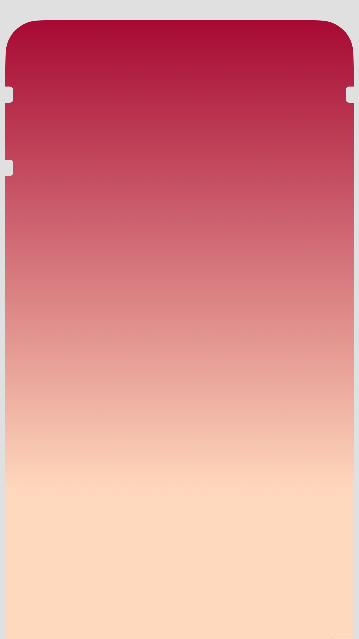
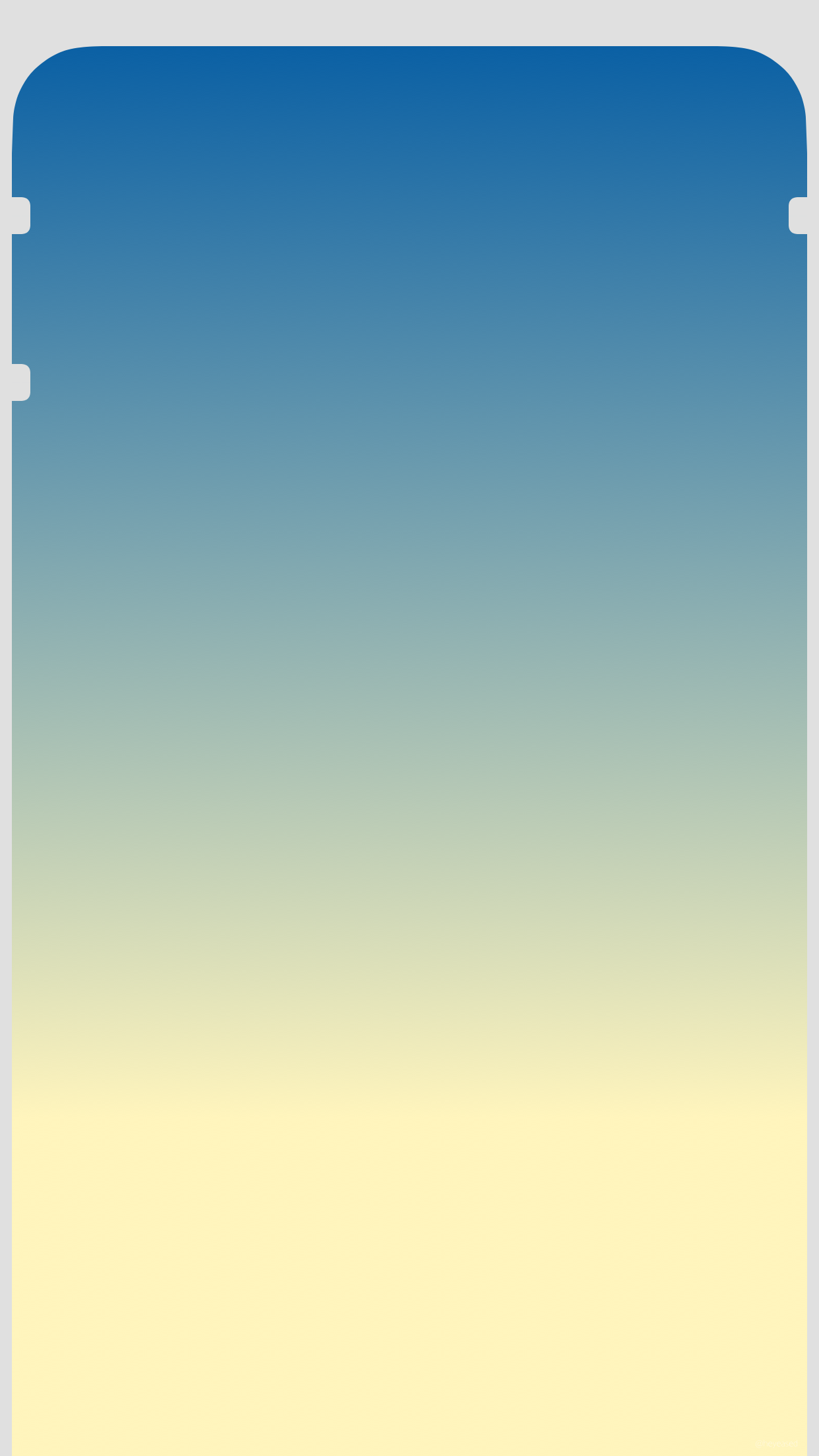
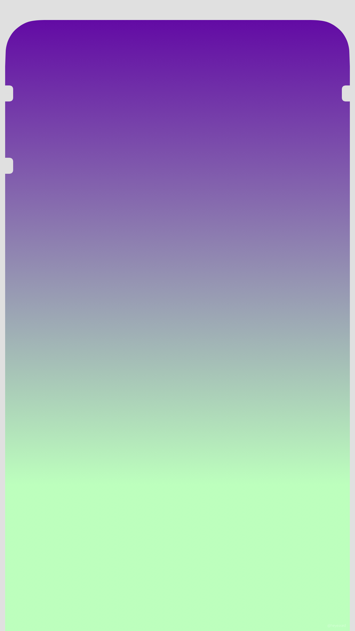
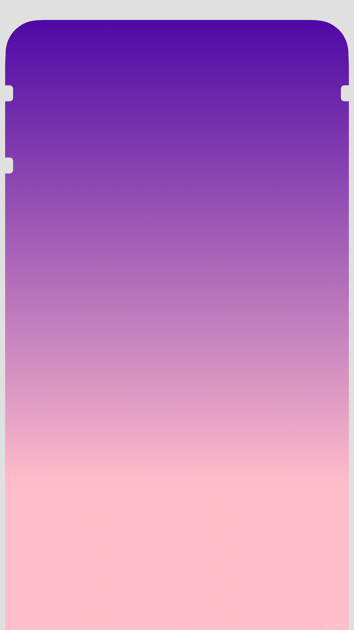
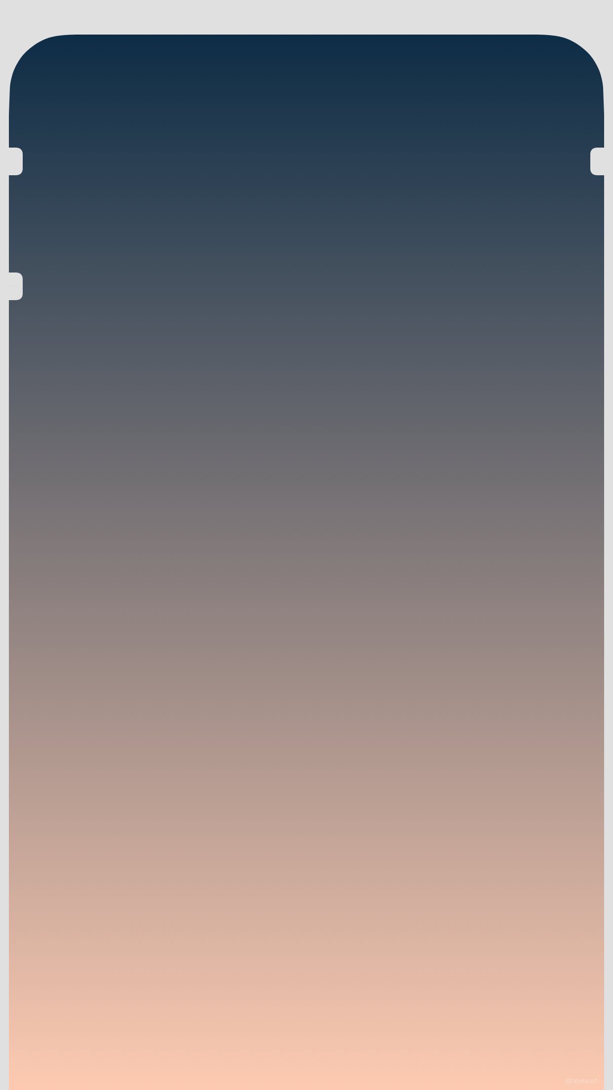
ドックがホーム画面を囲む壁紙。
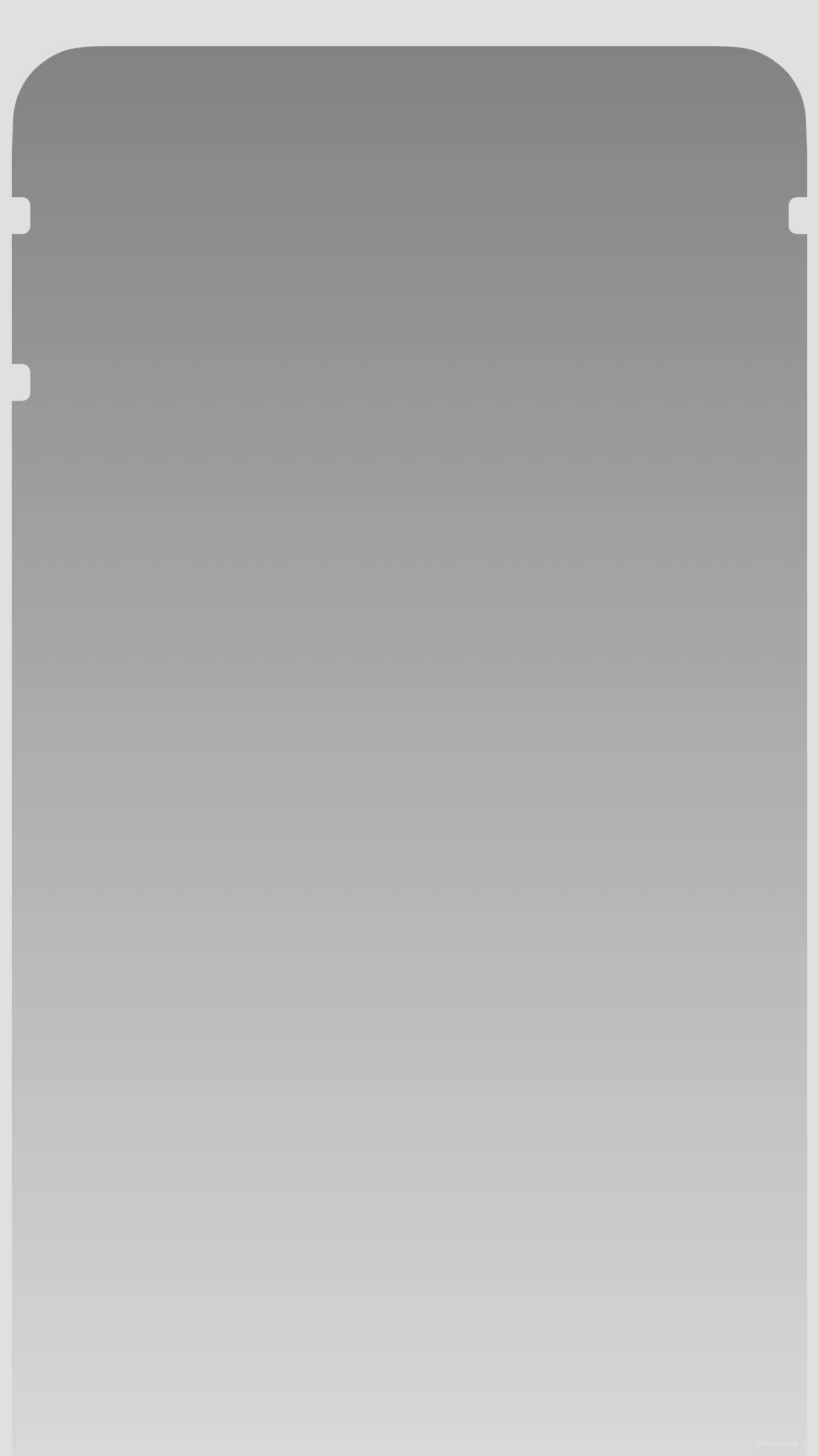
「透明度を下げる」用(ダミー)。
ボタンの指標付きバージョン。
Dock surrounds Home Screen.
For "Reduce Transparency". (It's fake)
The version with button marks.
「透明度を下げる」用(ダミー)。
ボタンの指標付きバージョン。
Dock surrounds Home Screen.
For "Reduce Transparency". (It's fake)
The version with button marks.
iPhone 8/7/6(s)/Plus/
SE1/5(s/c)/touch 6
iOS 10.2–11.4
SE1/5(s/c)/touch 6
iOS 10.2–11.4
1242×2208
Universal Wallpaper
Universal Wallpaper
音量ボタンとスリープ/スリープ解除ボタン(4.7/5.5インチスクリーンのみ)の位置を示す指標をホーム/ロック画面に表示します。各ボタンの位置はモデルによって異なります。マークはそれらが重なる所に置いています。
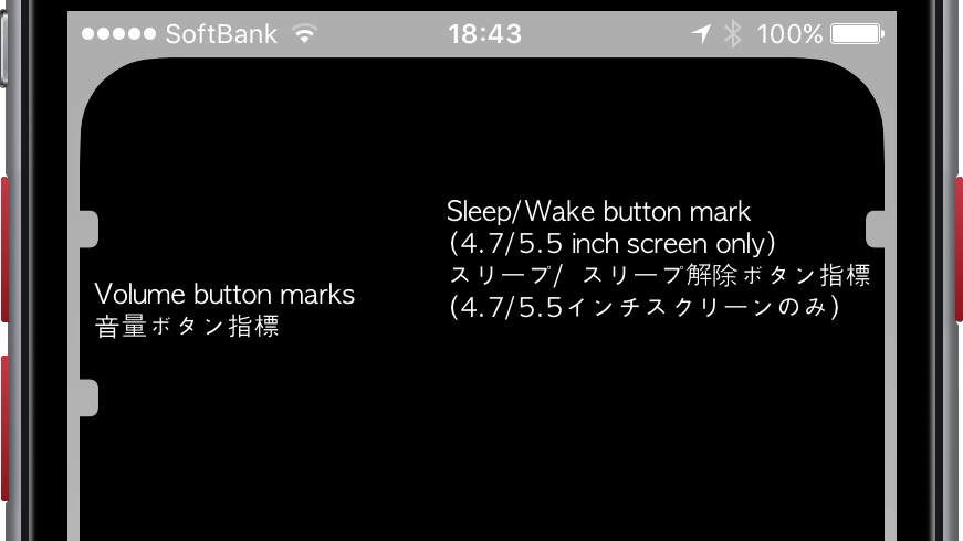
Marks showing the position of Volume button and Sleep/Wake button (4.7/5.5 inch screen only) are displayed on the Home/Lock screen. The positions of the buttons are different depending on the model. The marks of these wallpapers are where they overlap.
設定方法
_____________________________________
設定時に思い切りピンチイン。
(または「視差効果を減らす」をオン)
_____________________________________
設定アプリ→ 一般→アクセシビリティ
→コントラストを上げる
→「透明度を下げる」をオンにします。
_____________________________________
設定時に思い切りピンチイン。
(または「視差効果を減らす」をオン)
_____________________________________
設定アプリ→ 一般→アクセシビリティ
→コントラストを上げる
→「透明度を下げる」をオンにします。
タップして表示される画像を長押し保存
How to setup
_____________________________________
Pinch in full in the setting.
(Or turn On "Reduce Motion")
_____________________________________
Settings app → General →
Accessibility → Increase Contrast →
Switch "Reduce Transparency" On.
_____________________________________
Pinch in full in the setting.
(Or turn On "Reduce Motion")
_____________________________________
Settings app → General →
Accessibility → Increase Contrast →
Switch "Reduce Transparency" On.
Tap the thumbnail to load the original.


なぜ?
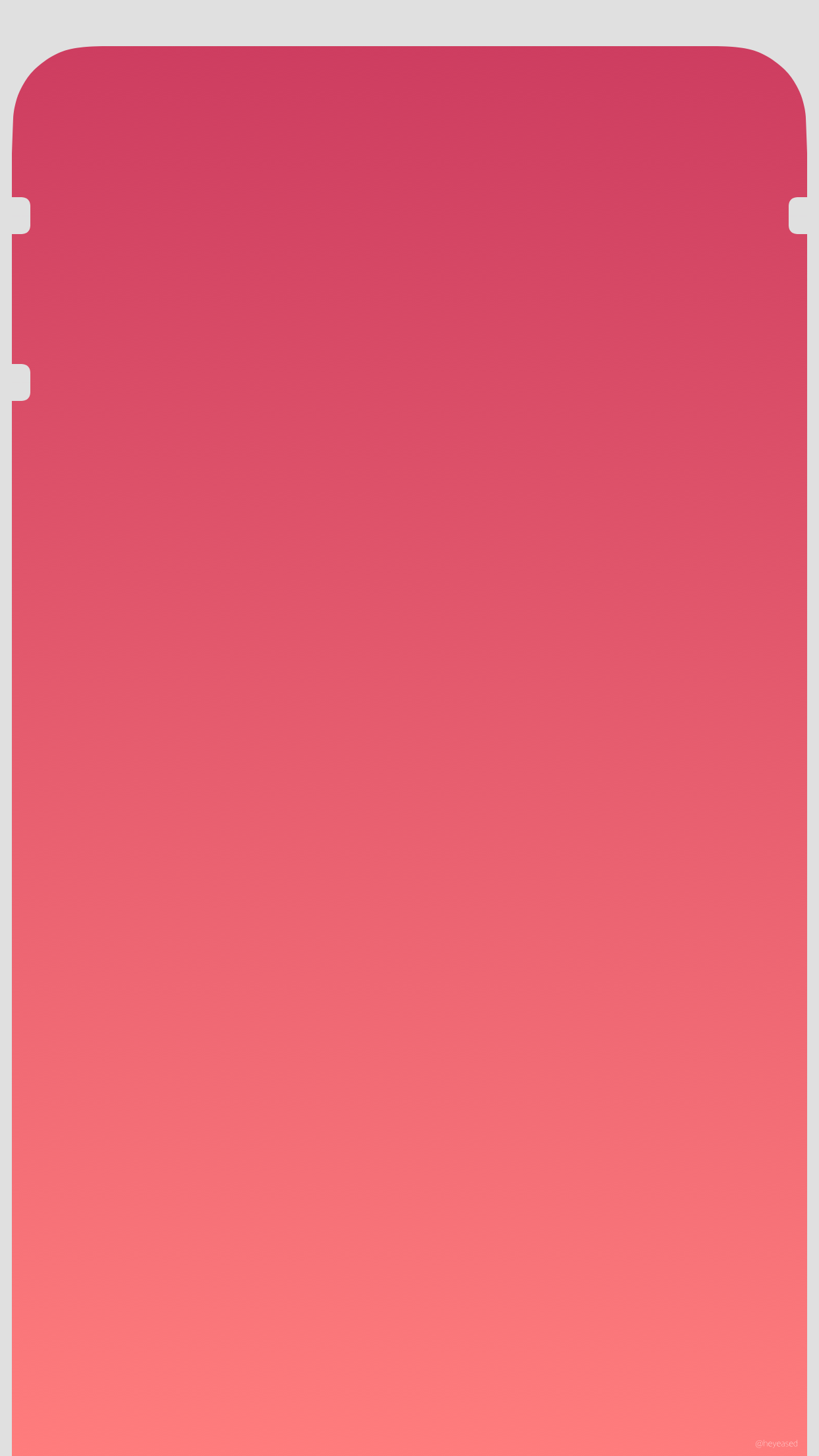
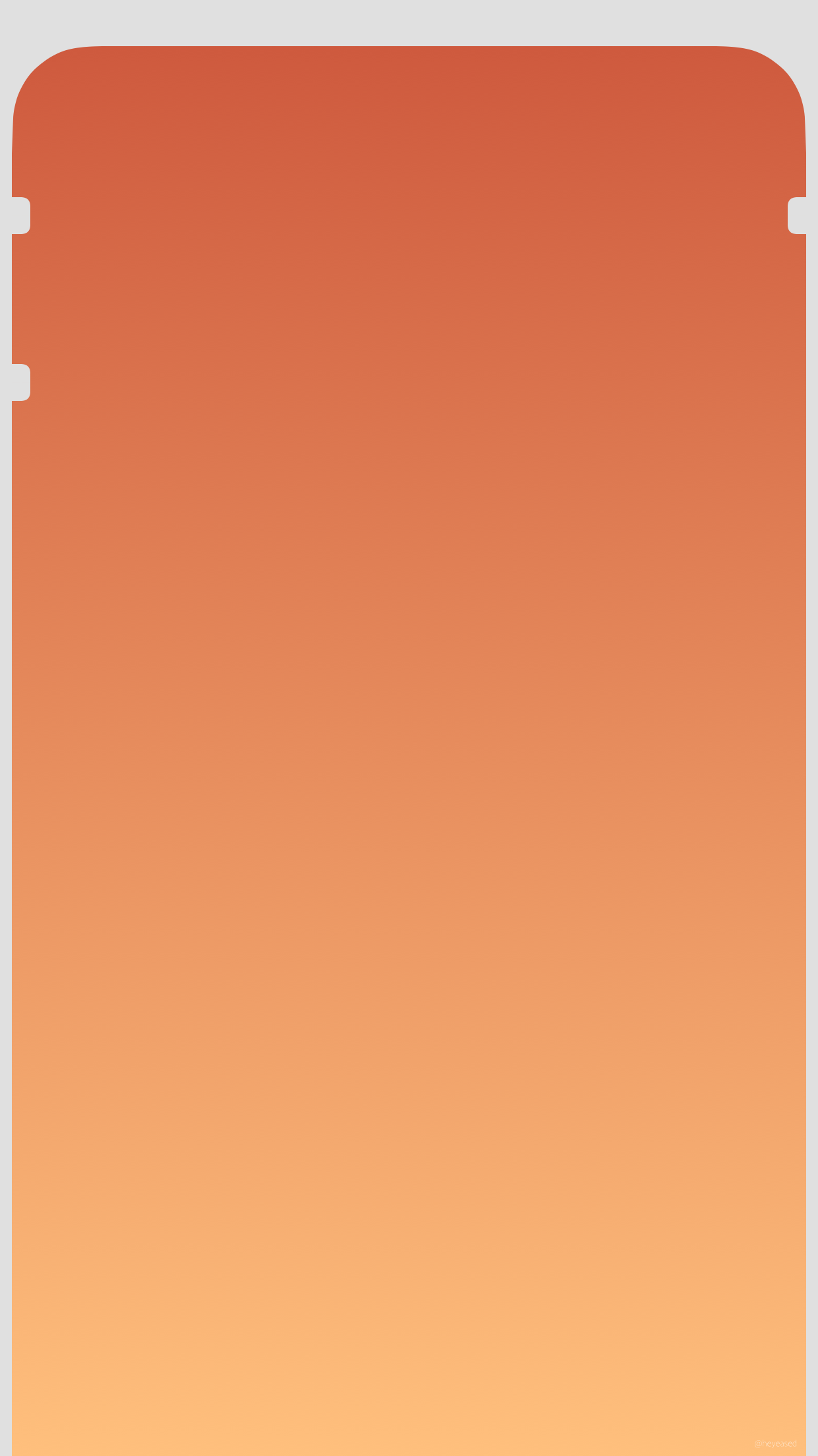
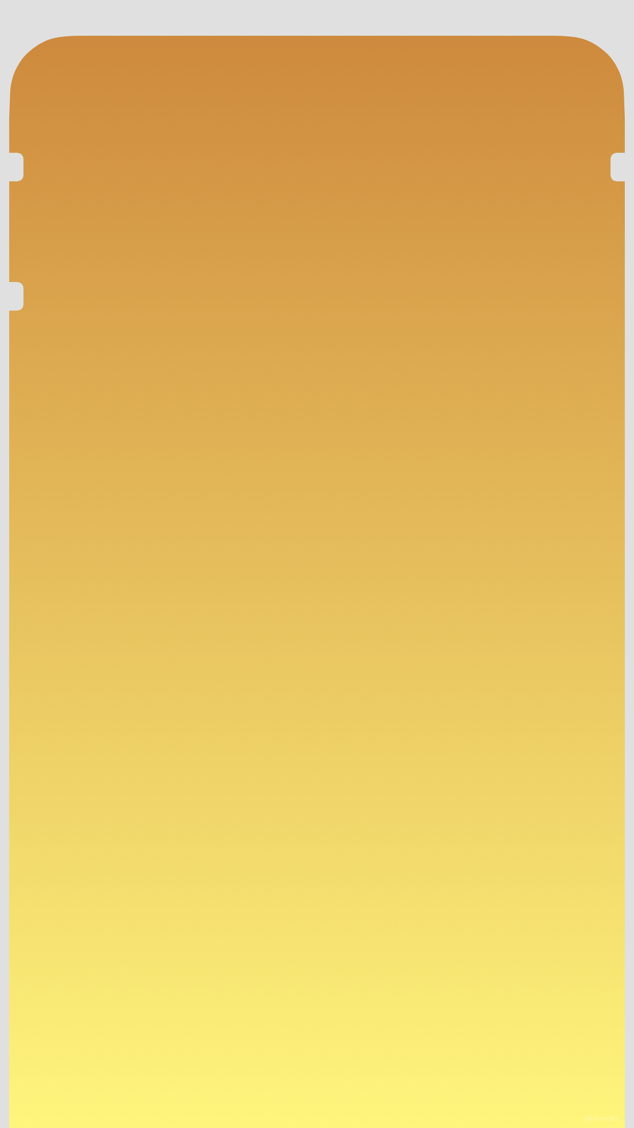
アクセシビリティの「透明度を下げる」をオンにしたときのドックと、フレームの接続部分がほぼ同じ色になるように調整した壁紙です。
透明度を下げるとドックの色は背景を問わず一定です。しかしこの色のフレームとの組み合わせはほとんどの背景でホーム画面が暗くなり、上に向かってより暗くなっていきます。そのためフレームはちょうどその分だけ明るめに(白背景以外)、また上の方のフレームの暗さが気にならないように背景(一部を除く)は上部が暗いグラデーションにしています。
アクセシビリティの「透明度を下げる」をオンにしたときのドックと、フレームの接続部分がほぼ同じ色になるように調整した壁紙です。
透明度を下げるとドックの色は背景を問わず一定です。しかしこの色のフレームとの組み合わせはほとんどの背景でホーム画面が暗くなり、上に向かってより暗くなっていきます。そのためフレームはちょうどその分だけ明るめに(白背景以外)、また上の方のフレームの暗さが気にならないように背景(一部を除く)は上部が暗いグラデーションにしています。
Why?
These are wallpapers adjusted so that the joint part of the frame and Dock when the accessibility "Reduce Transparency" is turned ON are almost the same color.
The color of Dock is constant regardless of the background as the transparency is lowered. However, with this color frame combination, the Home Screen becomes dark with most backgrounds and it gets darker upwards. For that reason the frame is just brighter (other than white background). And the backgrounds (excluding some) have a gradation with a dark upper part so that the darkness of the upper frame is not bothered.